When working with data in Excel, it’s often useful to have multiple scales on a single chart to better compare different sets of data. One way to achieve this is by adding a secondary axis to a pivot chart. This allows you to display two different scales on the same chart, making it easier to compare data sets that have vastly different ranges.
This post will guide you how to add secondary Axis to display the total series on an existing Pivot Chart in your worksheet in Excel 2013/2016/2019/365/Excel Mac. The below steps will guide you how to add a secondary axis to a pivot chart in Excel, so you can effectively compare and analyze your data.
Table of Contents
1. What is Secondary Axis in Excel
A secondary axis is an additional axis on a chart that is used to display a different set of data in Microsoft Excel. It is useful when you have data that spans two different scales, such as one set of data that has a large range of values and another set of data that has a smaller range of values.
The secondary axis allows you to display both sets of data on the same chart, but with two different scales, so that you can better understand the relationship between the two sets of data. And it is different with 3-axis chart that is used to display data with three variables (X-axis, Y-axis and Z-axis)
2. What is the difference between pivot table and pivot chart?
A pivot table and a pivot chart are both tools used to summarize and analyze large amounts of data in Microsoft Excel. However, they have different purposes and provide different types of visualizations.
- A pivot table is a tabular representation of data that allows you to summarize, aggregate, and filter your data in a flexible and dynamic way.
- A pivot chart, on the other hand, is a graphical representation of the data in a pivot table. It provides a visual representation of the trends and patterns in your data, making it easier to understand and communicate the insights from your data.
3. Add Secondary Axis to Pivot Chart
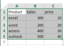
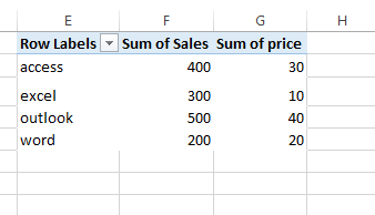
Assuming that you have a list of data in range A1:C5, and you want to create a pivot table based on those data, and then create a pivot chart based on this pivot table. I also need to add secondary axis to the created pivot chart in your worksheet. How to do it. You just need to do the following steps:
Step 1: select the range of cells that you want to use to create pivot table, including both the primary and secondary data series.
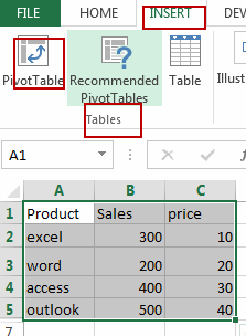
Step 2: go to INSERT tab, click PivotTable command under Tables group. And the Create PivotTable dialog will open.
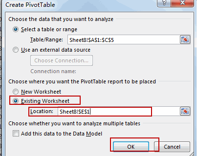
Step 3: choose Existing Worksheet option, and select one cell to place the pivot table. Click Ok button. And the PivotTable Fields pane will appear.
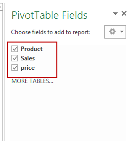
Step 4: choose all fields under the Choose fields to add to report section. And close the PivotTable Fields pane. You would notice that the pivot table is created in your worksheet.
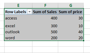
Step 5: select pivot table you created in the above steps.
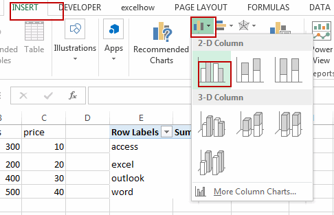
Step 6: go to INSERT tab, click Insert Column Chart command under Charts group. And select Clustered Column or Stacked bar chart . And the pivot chart is created.
Step 7: right click Sum of Sales series, and select Format Data Series from the popup menu list. And the Format Data Series pane will appear.
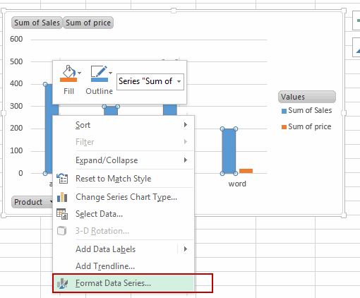
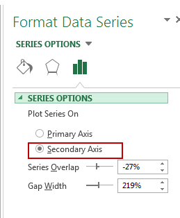
Step 8: select Secondary Axis option under SERIES OPTIONS section. And the close the Format Data Series pane.
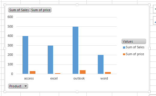
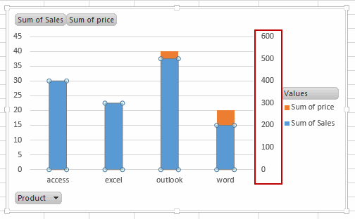
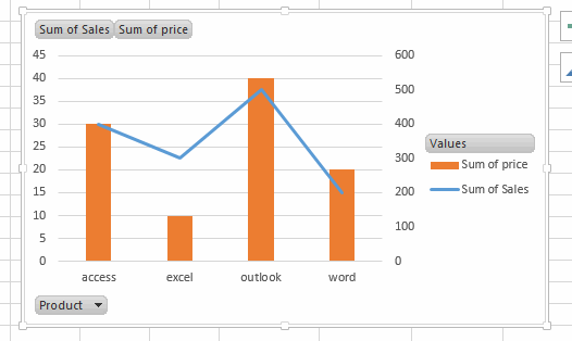
Step 9: you would notice that the secondary axis has been added into your pivot chart.
Step 10: right click on the Sum of Sales series again, and select Change Series Chart Type from the popup menu list. And the Change Chart Type dialog will open.
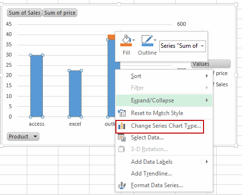
Step 11: click Combo, and select a Line Chart type for Sum of Sales series. And click OK button.
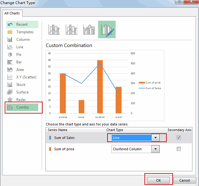
Step 12: let’s see the current pivot chart with secondary axis.
4. Adding Trendlin to Chart (Stacked bar or Clustered Column)
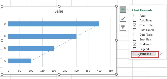
If you want to add Trendline in your chart, and you just need to click on the “+” button in the top right corner of the chart.
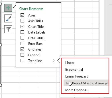
Then you can choose the type of trendline you want to add, such as a linear, polynomial, or exponential trendline.
5. Conclusion
Adding a secondary axis to a pivot chart in Excel is a useful way to display multiple data sets in a single chart. By following the steps outlined in this article, you can easily plot two sets of data on different scales, allowing you to make accurate comparisons and gain insights into your data.
Leave a Reply
You must be logged in to post a comment.