This post will guide you how to create a graph or chart in Microsoft Excel. You will learn that how to create a simple Chart in Excel. You can learn that how to create different types of charts in Excel, or how to change the Excel Chart type, etc.
- Create chart
- Change Chart Type
- Change Legend Position
- Display Data Labels
- Display Data Table
- Switch Row/Column
Table of Contents
Create New Chart
If you want to create a graph or chart based on the specified data in your worksheet, you can refer to the following steps:
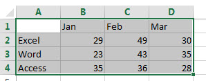
1# select the data range, such as: A1:D4
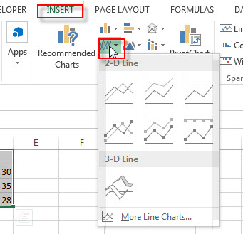
2# go to Insert Tab, Click Insert Line Chart button under Charts group.
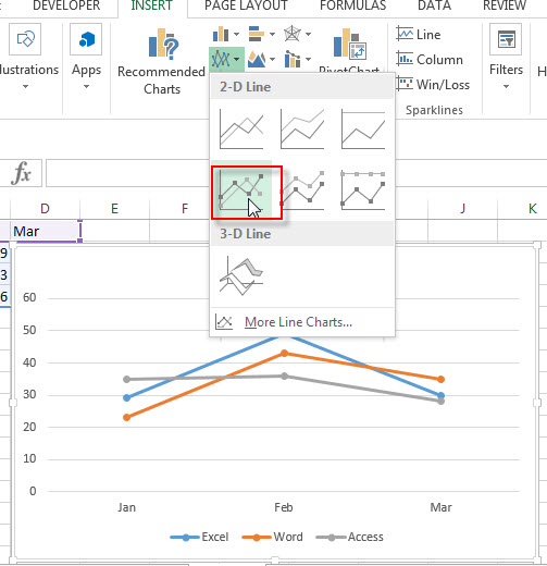
3# click any one Line with Markers from the drop down list
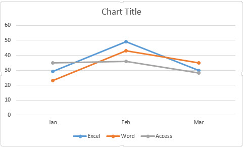
4# you will see that one Excel Chart has been generated as below:
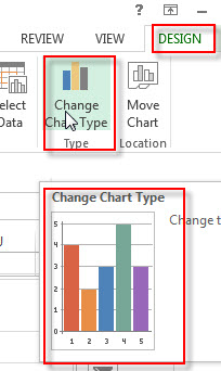
Change Chart Type
There are 9 Chart types that you can choose in Excel 2013, such as, Line Chart, Pie chart, Bar chart, Column chart, Area chart, Stock chart, surface chart, radar chart and Combo chart. So your current chart type is not well-suited for your newly data, and you can easily change it to other chart type. Just do the following steps:
1# Select the chart that you want to change the type
2# go to Design Tab, click Change Chart Type command under Type Group.
3# the Change Chart Type window will appear.
4# select one chart type that you want to change to on the left side.
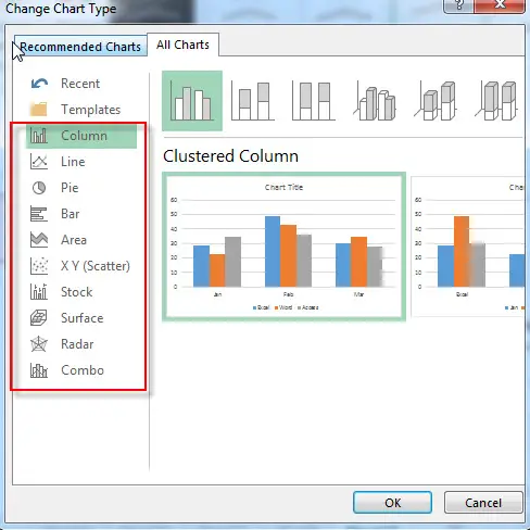
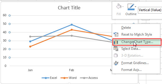
Or you can directly right-click anywhere within the chart and then select Change Chart Type…. Form the drop down list. Then the Change Chart Type window will appear.
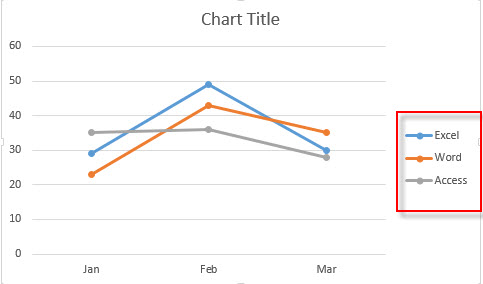
Change Legend Position
If you want to move the legend to the right side of the chart, just refer to the following steps:
1# Select the chart
2# click the Chart Elements ( +) button on the right side of the chart, select the Legend checkbox, then select the position as Right menu.
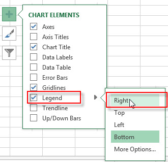
3# let’s see the result that the legend has been moved to the right side of the chart.
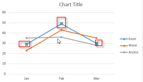
Display Data Labels
If you want to display data labels on a single data point, you can following the steps to add data labels:
1# Select the chart
2# click one data point that you want to display the data labels, such as, Excel data point.
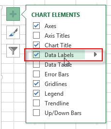
3# click the Chart Elements ( +) button on the right side of the chart, select the Data labels checkbox.
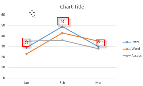
4# let’s see the result.
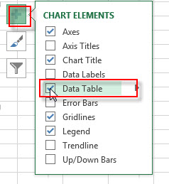
Display Data Table
You can also display the data table in the chart or graph, do following steps:
1# Select the chart.
2# click the Chart Elements ( +) button on the right side of the chart, select the Data table checkbox.
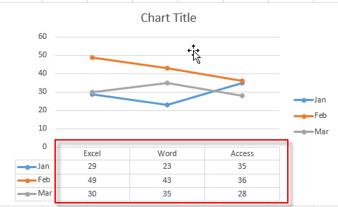
3# Let’s see the result.
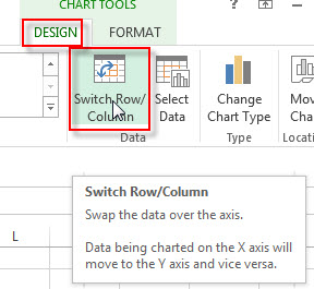
Switch Row/Column
If you want to move the data being charted on the X axis to the Y axis, just do the following steps to swap the data over the axis:
1# Select the chart
2# go to Design Tab, click Switch Row/Column command under Data group.
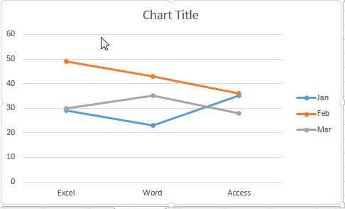
3# let’s see the result.
Leave a Reply
You must be logged in to post a comment.