Adding Drop Lines in Excel Line Chart
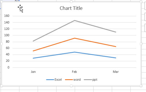
This post will guide you how to add drop lines to a line chart or graph in Excel. You can add drop lines to a line chart to connect the data point on the axis. It can make it easier to determine the X value where each data point occurs.
Adding Drop Lines in Excel Line Chart
To add drop lines to an Existing Excel Line chart, just do the following steps:
#1 Select the existing Line Chart.
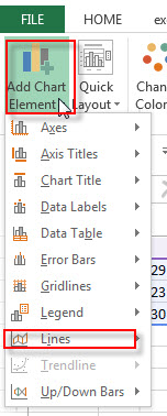
#2 go to the Design Tab, click Add Chart Element button under the Chart Layouts group.
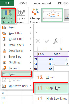
#3 Select Lines, then click Drop Lines.
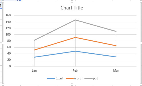
4# let’s see the last result.
This post will guide you how to show or hide chart Axis in your current worksheet in Excel 2013/2016. How do I show or hide Axes or 3-D chart Axes, Horizontal Axis, Vertical Axis or secondary Vertical Axis in your ...
In most excel worksheets we need to add charts to illustrate data clearly. And to make chart noticeable, we can fill chart background with color or insert a picture as background. If you want to know how to implement above ...
We can create a chart by quick analysis easily if data source in chart horizontal and axis label is listed in the contiguous range. But the data source is listed in different ranges, the chart created by quick analysis cannot ...
If we inserted a large number of charts and want to delete all of them quickly how can we do? It will spend a lot of time if we delete them one by one in excel. So we need a ...
This post will guide you how to create combination chart and adding secondary axis in Excel. How do I create a combination chart so that you can deliver a visual representation for multiple data source. Create Combination Charts Assuming that ...
This post will guide you how to smooth the angles of line chart in your current worksheet. How do I make a smooth line chart based on your data in Excel 2013/2016. Smooth the Angles of Line Chart When you ...
This post will guide you how to copy formatting from one chart to another chart in Excel. How do I copy chart formatting to anther chart in Excel 2013/2016. Copy Chart Formatting with Paste Special Copy Chart Formatting with Short ...
This post will guide you how to reverse the order of a chart Axis in your current worksheet in Excel 2013/2016. Assuming that you have created a column chart based on your data in your worksheet, and you may want ...
This post will guide you how to create a stock chart to present your stock’s data in an easy to read manner in your current worksheet in Excel. How do I create a High-Low-Close Stock market chart based on your ...
This post will guide you how to create a column chart with two-level Axis labels based on your original data in Excel. How do I create a Two-level X axis labels in your Chart with Pivot table in Excel 2013/2016. ...