This post will guide you how to create a Pareto chart in Excel 2013/2016. How do I create a Pareto Chart with Excel 2016.
1. What is Pareto Chart?
A Pareto chart, named after Vilfredo Pareto, is a type of chart that contains both bars and a line graph, where individual values are represented in descending order by bars, and the cumulative total is represented by the line.
2. Create a Pareto Chart
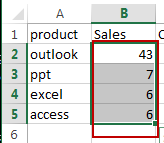
Assuming that you have a list of data in range A1:B5, in which contain sales data. And you want to create a Pareto chart based on those data in Excel 2013 or 2016. You can use the following steps:
#1 select the Sales data from B2:B5 in Sales column.
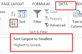
#2 go to DATA tab, click Sort Largest to Smallest command under Sort & Filter group to sort your selected data from largest to smallest. And the Sort Warning dialog will open. Click Sort button.
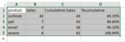
#3 create a Cumulative Sales column in Column C, and then type the following formula in Cell C2 to calculate the cumulative sales, press Enter key on your keyboard.
=B2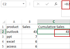
#4 type the following formula in Cell C3, and press Enter key, and then drag the AutoFill Handle till the end. You would notice that all Cumulative Sales values are calculated.
=C2+B3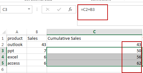
#5 create a Cumulative Percentage column in Column D. Then entering the following formula in Cell D2, press Enter key. Then drag the AutoFill Handle till the end.
=C2/$C$5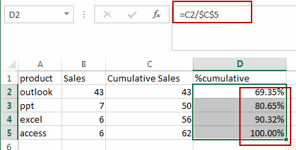
#6 select the data in range A1:D5.
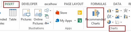
#7 go to INSERT tab, click Recommended Charts command under Charts group. And the Insert Chart dialog will open.
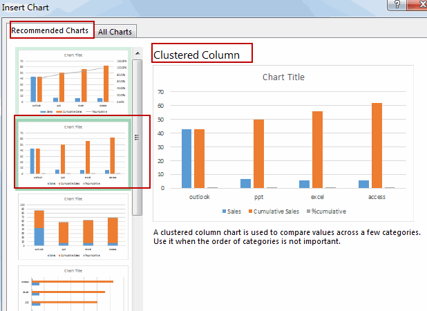
#8 select Clustered Column chart in the Recommended Charts list. And click OK button.
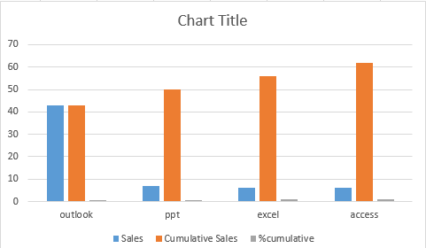
#9 so the created chart will be:
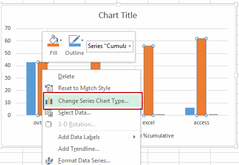
#10 right click on any of the bars in your chart and click Change Series Chart Type from the pop up menu list. And the Change Chart Type dialog box will open.
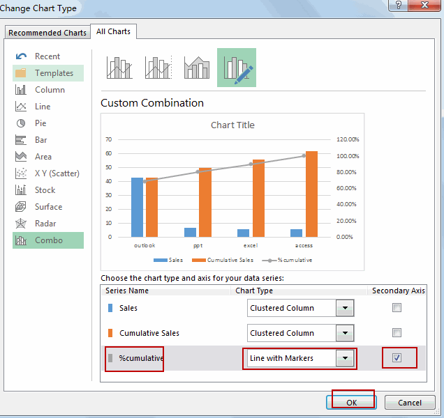
#11 choose Line with Markers type under % cumulative Series. And then check the Secondary Axis tick box. Click OK button.
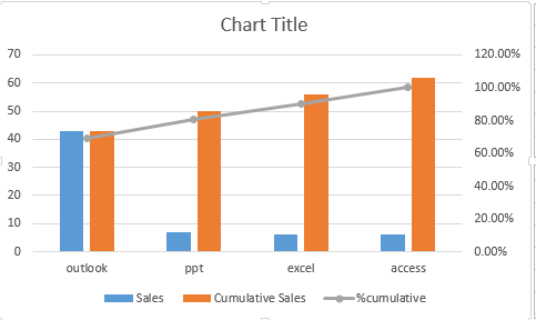
#12 the Chart will be:
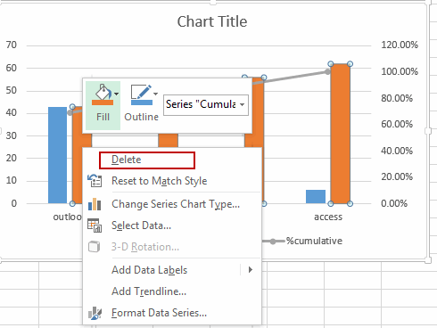
#13 right click on the Cumulative Sales series bar in your chart, and click delete from the popup menu list.
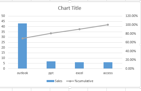
#14 then you have created a Pareto chart based on your data successfully.
3. Video: Create a Pareto Chart
This Excel video tutorial, we’ll guide you through the process of visualizing data using this powerful analytical tool, which is excellent for identifying the most significant contributors to a problem.
Leave a Reply
You must be logged in to post a comment.