This post will explain that how to create a basic scatter chart in your current worksheet based on the specified data points in Excel. You will learn that how to create a scatter plot or XY scatter chart in Excel. You can use the scatter chart to show the relationship between set of values.
Create Scatter Chart
If you want to create a Scatter chart in your current worksheet, just need to the do following steps:
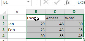
1# Select the data range that you want to use for the scatter chart, such as: B1:D4.
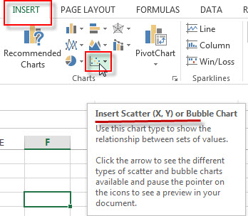
2# go to Insert Tab, Click Insert Scatter (X,Y) or Bubble Chart button under Charts group. (You can click the arrow to see the different types of scatter and bubble charts available and pause the pointer on the icons to see a preview in your worksheet)
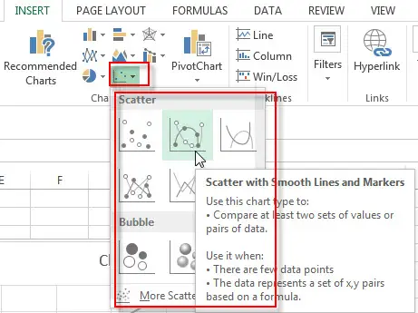
3# click any one Scatter or Bubble from the drop down list.
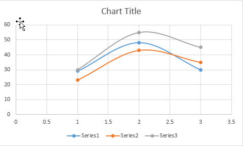
4# you will see that one Excel Scatter Chart has been generated as below:
Leave a Reply
You must be logged in to post a comment.