This post will explain that how to create a basic Pie chart in your current worksheet based on the specified data points in Excel. The pie chart is also one of the most commonly used charts in Excel. And you can create a Pie Chart to show the percentage each slice of the pie represents of the total chart value. So you can use the pie chart type to show proportions of a whole. And you can use it when the total of your numbers is 100%.
When you want to show numbers as a proportion of the total value or there are only a limited number of pie slices, then you can consider to create a pie chart in your worksheet.
Create Pie Chart
If you want to create a pie chart in your current worksheet, just need to the do following steps:
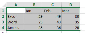
1# Select the data range that you want to use for the pie chart, such as: A1:D4 (click the arrow to see the different types of pie and doughnut charts available)
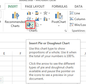
2# go to Insert Tab, Click Insert Pie button under Charts group.
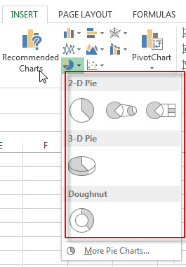
3# click any one Pie or doughnut from the drop down list
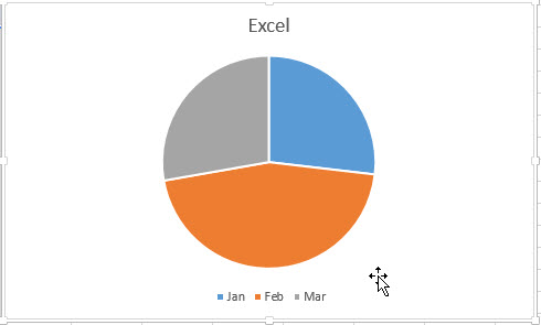
4# you will see that one Excel Pie Chart has been generated as below:
Leave a Reply
You must be logged in to post a comment.