This post will teach you how to add a horizontal benchmark line to an existing Excel chart or graph in excel. How do I add a horizontal baseline or target line to a chart or graph gives loads of context for the viewer.
For example, you have a simple Excel spreadsheet tracking product sales. And you have a column with dates and another with sales. And you have made a simple chart with both columns as data sources. And you want to add a horizontal baseline to this chart so that the user can see how close they are to their target sales. You can follow this guide to achieve the result.
Table of Contents
Adding a horizontal Benchmark/Baseline/Target Line to a Chart or Graph
To add a horizontal benchmark line to a chart, just do the following steps:
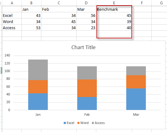
#1 create a new benchmark line column that contains benchmark sales data.
#2 Right-click on the existing chart, and choose Select Data… from the drop-down menu list.
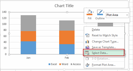
#3 the Select Data source window will appear.
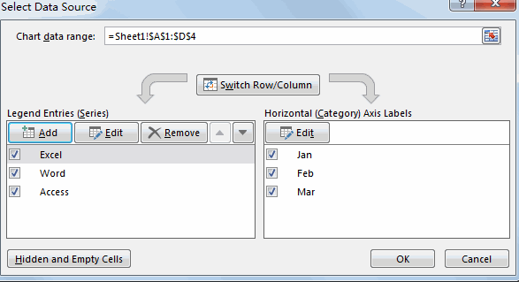
#4 click Add button under Legend Entries section, the Edit Series window will appear.
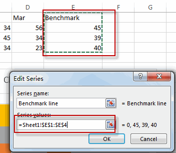
#5 enter one Series name such as: Benchmark line into the Series name text box. Then select benchmark line column as its series values. Then click OK button.
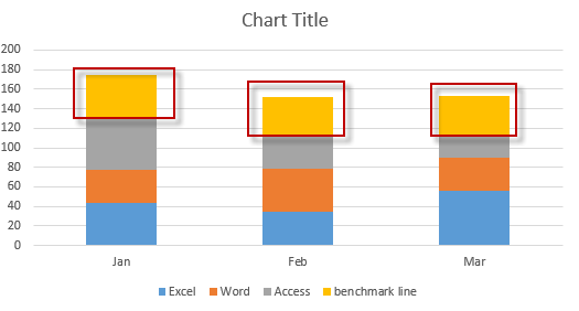
#6 you will see that the benchmark line column has been added into the cart.
#7 Right-click on the newly benchmark line series, and select Change Series Chart Type from the drop down menu list. The Change Chart Type window will appear.
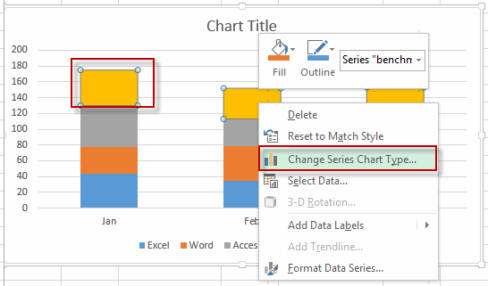
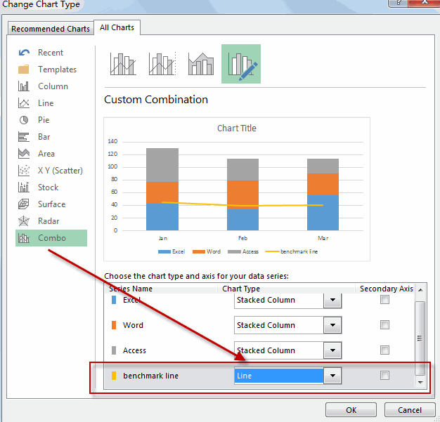
#8 Select chart type as line for the benchmark line series.
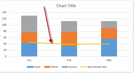
So far, the horizontal benchmark line or baseline is added into the existing chart.
2. Video: Add a horizontal Benchmark to a Chart or Graph
This Excel video tutorial where we’ll explore how to add a horizontal benchmark column to a chart or graph in Excel. By using this method, you can effectively highlight a reference point within your data visualization.
Leave a Reply
You must be logged in to post a comment.