This post explains how to add a horizontal average line to an existing Excel chart or graph in excel. How do I add a horizontal average line to a chart or graph gives loads of context for the viewer. How to use Excel VBA Macro to add a horizontal average line to the existing chart in Excel.
For example, you have a simple Excel spreadsheet tracking product sales. And you have a column with dates and another with sales. And you have made a simple chart with both columns as data sources. And you want to add a horizontal average line to this chart so that the user can see how close they are to their average sales. You can follow this guide to achieve the result.
Table of Contents
Adding a horizontal Average Line to a Chart or Graph
To add a horizontal average line to a chart, just do the following steps:
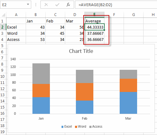
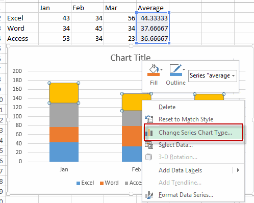
#1 create a new average line column that contains average sales data. And type the following formula into the first cell of average column. =AVERAGE(B2:D2), then drag the AutoFill Handle over to the average columns.
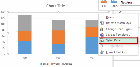
#2 Right-click on the existing chart, and choose Select Data… from the drop-down menu list.
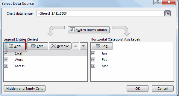
#3 the Select Data source window will appear.
#4 click Add button under Legend Entries section, the Edit Series window will appear.
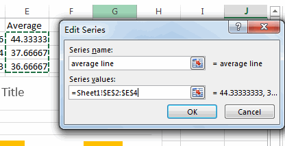
#5 enter one Series name such as: Average line into the Series name text box. Then select average line column as its series values. Then click OK button.
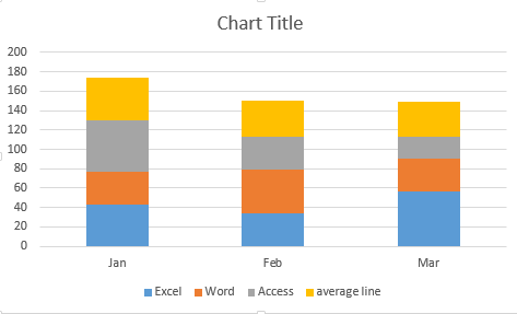
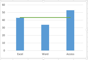
#6 you will see that the average line has been added into the cart.
#7 Right-click on the newly average line series, and select Change Series Chart Type from the drop down menu list. The Change Chart Type window will appear.
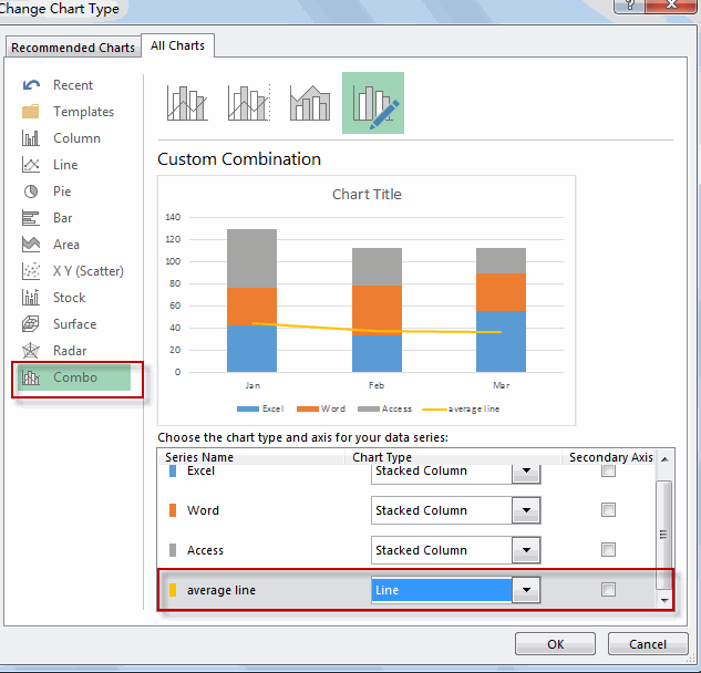
#8 Select chart type as line for the average line series.
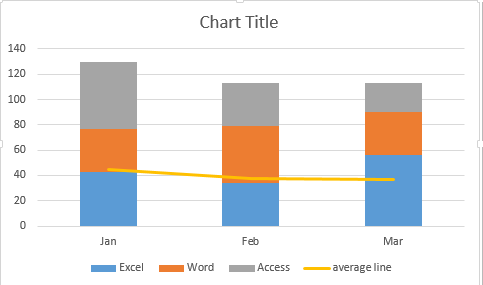
So far, the horizontal average line is added into the existing chart.
Adding a horizontal Average Line to a Chart or Graph with VBA
You can also write an Excel VBA Macro to add a horizontal average line to an excel chart, just do the following steps:
#1 click on “Visual Basic” command under DEVELOPER Tab.
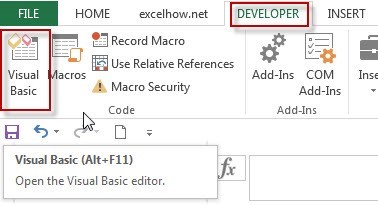
#2 then the “Visual Basic Editor” window will appear.
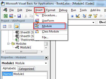
#3 click “Insert” ->”Module” to create a new module.
#4 paste the below VBA code into the code window. Then clicking “Save” button.
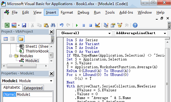
Sub AddAverageLineChart()
    Dim S As Series
    Dim A As Variant
    Dim T As Double
    Dim O As Variant
    If VBA.TypeName(Application.Selection) <> "Series" Then Exit Sub
    Set S = Application.Selection
    A = S.Values
    T = Application.WorksheetFunction.Average(A)
    ReDim O(LBound(A) To UBound(A))
    For i = LBound(O) To UBound(O)
        O(i) = T
    Next
    With ActiveChart.SeriesCollection.NewSeries
    .XValues = S.XValues
    .Values = O
    .Name = "Average line" & S.Name
    .AxisGroup = S.AxisGroup
    .MarkerStyle = xlNone
    .Border.Color = S.Border.Color
    .ChartType = xlLine
    .Format.Line.ForeColor.ObjectThemeColor = msoThemeColorAccent6
    End With
End Sub
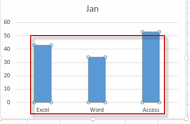
#5 select all data of columns in your chart.
#6 back to the current worksheet, then run the above excel macro. Click Run button.
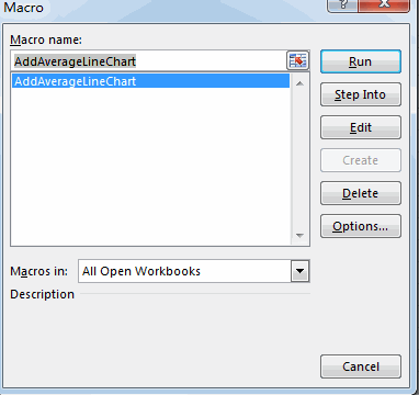
#7 Let’s see the result.
Related Functions
- Excel AVERAGE function
The Excel AVERAGE function returns the average of the numbers that you provided.The syntax of the AVERAGE function is as below:=AVERAGE (number1,[number2],…)….
Leave a Reply
You must be logged in to post a comment.