This post will guide you how to add a moving average line to an Excel chart. How do I add moving average line in an excel chart.
A moving average is an average of the data in your table, and it will calculate over a defined period of time. So you can use the moving average linen to identify significant trends in the chart. And the moving average uses a specific number of data points to average them, and then use the average value as a point in the chart line.
Add a Moving Average Line to a Chart
The below steps will talk that how to add moving average line in an existing chart.
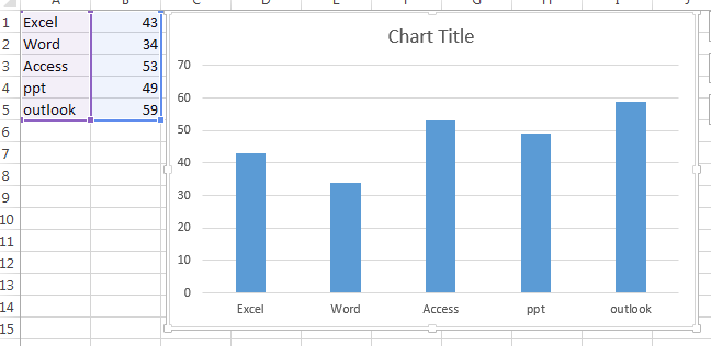
#1 select the column chart that you want to show the moving average line
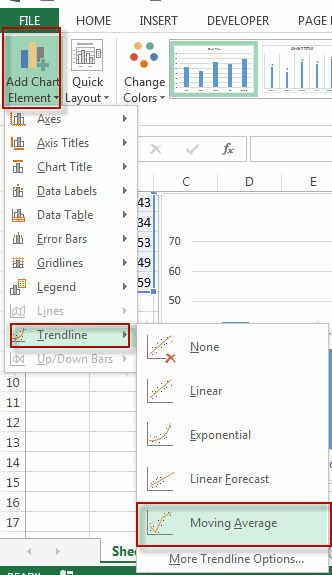
#2 go to DESIGN tab, click Add Chart Element command under Chart Layouts group, and click Trendline menu from the pop-up menu list, and then select moving average.
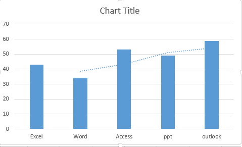
#3 you will see that the moving average line is added in the current chart.
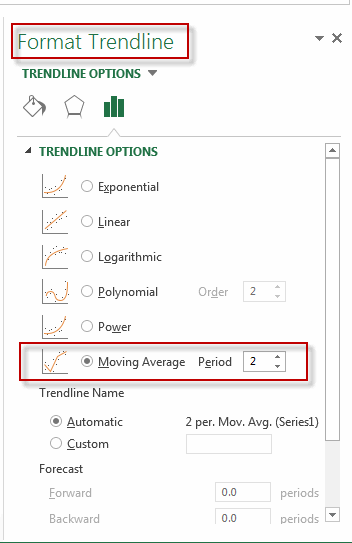
#4 if you want to format the moving average line, for example, you want to change the period of the moving average line, you can double click on the moving average line in the chart, then the Format Trendline panel will appear, just click TrendLine Options to change the period.
Leave a Reply
You must be logged in to post a comment.