We can create a chart by quick analysis easily if data source in chart horizontal and axis label is listed in the contiguous range. But the data source is listed in different ranges, the chart created by quick analysis cannot show data properly as we expect. So this article will show you the way to insert a chart customized with source data displays in different ranges.
First see the example below:

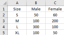
This table is created with all data source listed in a contiguous range.
Select the range, click Ctrl+Q
to load quick analysis tool.
Select Charts, and select one chart type you want to show your chart, then a chart is created properly.

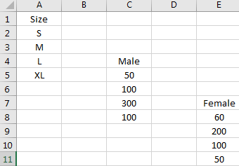
If the table is displayed like below:

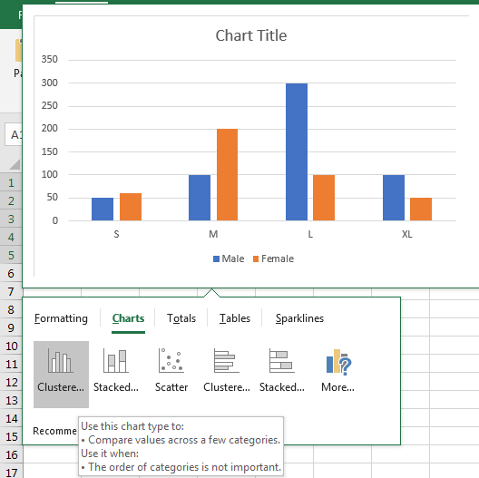
Insert a chart refer to above steps, you may get a chart like below:

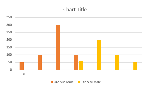
So we need another way to insert a chart can meet our requirements.
Insert a Chart Customized with Source Data Displays in Different Ranges
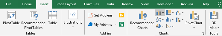
Step1: Click on Insert->Column Chart icon (In Charts).

Step2:Click on Column Chart icon to load all column chart type like 2-D Column, 3-D Column etc.

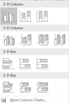
Step3:Select chart type per your requirement. In this case we select 2-D Column->Clustered Column (the first one). Then a blank chart is inserted into current worksheet.
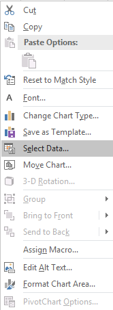
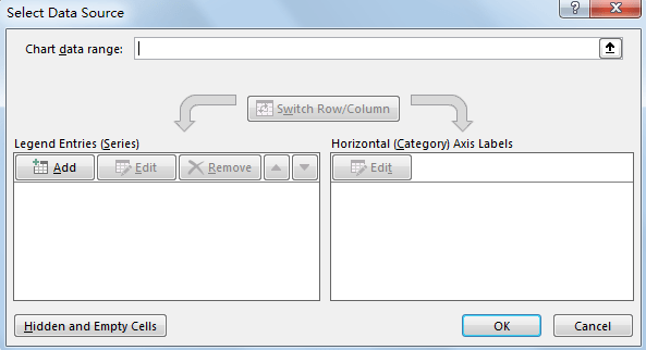
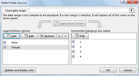
Step4: On the blank chart, right click to load chart menu. Then click Select Data to load Select Data Source window.

Step5: Select Data Source window:

Step6: Click Add to add Legend Entries (Series) in the chart.
Step7: In the pops up Edit Series dialog, enter Series name=Sheet1!$C$4, which is saved the series name Male. Enter Series values=Sheet1!$C$5:$C&8, which is saved data source for Male. User can fill the series name and series value by select the range manually.

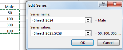
Step8: Click OK button. Then series Male is added properly.

Step9: Repeat above steps for adding Female.
Edit Series for Female:

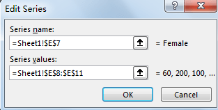
Add Series for Female:

Step10: Click Edit button to edit Axis Label. In Axis label range, enter =Sheet1!$A$2:$A$5, which is saved Size data.

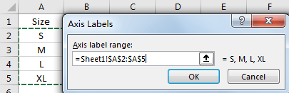
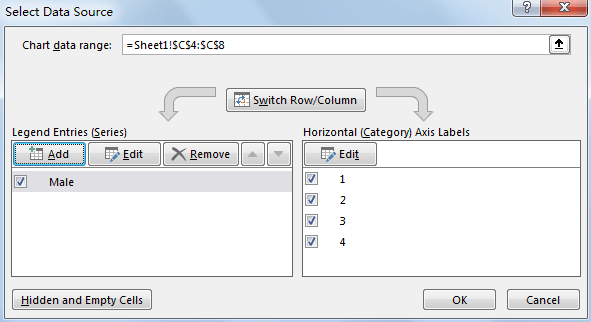
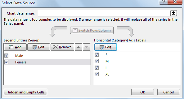
Step11: Click OK. Then data source is updated properly in Horizontal (Category) Axis Labels.

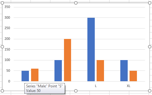
Step12: Click OK. Then chart is created by our requirement properly.

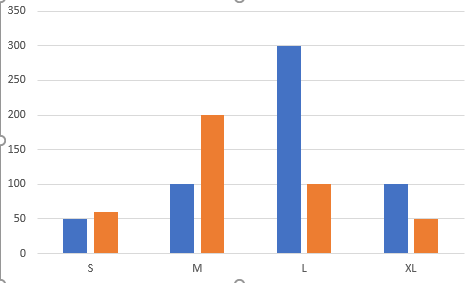
Step13: Move your mouse on each column. Then you can see the details for each column in floating message.

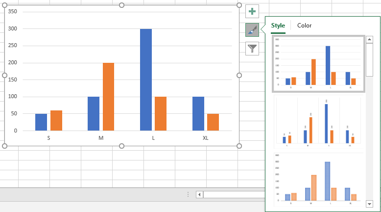
Step14: Click on Chart Style icon, you can change the chart Style or chart Color per requirement.

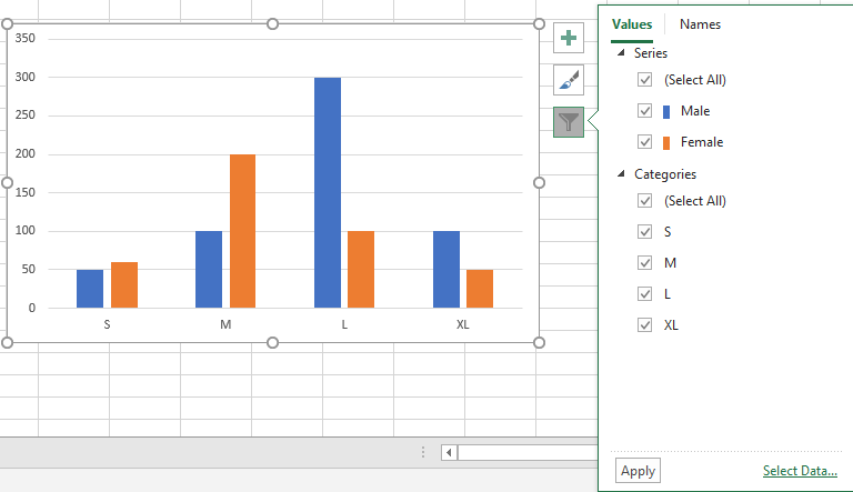
Step15: Click on Chart Filters, you can set filters for your chart and display the information you want to show on chart.

Related Posts
Calculate Number of Hours between Two Times
Calculating the difference between two times might be a valuable statistic for subsequent computations or averages, whether you're producing a time sheet for staff or recording personal exercises. While Excel has a plethora of complex functions, including date and time ...
Calculate Loan Interest in Given Year
When you borrow money, you are supposed to repay it gradually. Lenders, on the other hand, want to be compensated for their services and the risk they incur by lending you money. That is, you will not just repay the ...
Calculate Interest Rate for Loan
The interest rate is the fee charged by a lender to a borrower and is expressed as a percentage of the principal—the lent amount. The interest rate on a loan is often expressed as an annual percentage rate, abbreviated as ...
Calculate Interest for Given Period
Using the IPMT function in Excel, we can compute the interest payment on any loan. This step-by-step tutorial will guide Excel users of all skill levels through the process to calculate interest for given period. Finally, the formula: =IPMT(B3/12,1,B5,-B2) The ...
How To Use Excel GCD Function
This post will guide you how to use Excel GCD function with syntax and examples in Microsoft excel. Description The Excel GCD function Returns the greatest common divisor of two or more integers. So you can use the GCD function ...
Calculate A Ratio From Two Numbers In Excel
In elementary mathematics, a ratio is a connection or comparison between two or more integers. For example, ratios are often expressed as ":" to demonstrate the relationship between two numbers. You would think that manually calculating a ratio from two ...
How To Use Excel RRI Function
This post will guide you how to use Excel RRI function with syntax and examples in Microsoft excel. Description The Excel RRI function Returns an equivalent interest rate for the growth of an investment. So you can use the RRI ...
CAGR Formula Examples in Excel
CAGR in Excel is a formula that calculates the compound annual growth rate for any invested amount over the specified years or timeframe. Although there is no direct function in Excel that can help us identify the CAGR value, there ...
Build Hyperlink With VLOOKUP in Excel
You might have come across a task in which you were assigned to build hyperlinks, which seems very easy, and if you are new to excel or don't have enough experience with it, then you might wonder about doing this ...
Break ties with helper COUNTIF and column
Suppose you got a task to adjust the values that contain the ties; what would be your first attempt to break the ties of the given value? If you are wondering about doing this task manually, let me add that ...