This post will guide you how to create combination chart and adding secondary axis in Excel. How do I create a combination chart so that you can deliver a visual representation for multiple data source.
Create Combination Charts
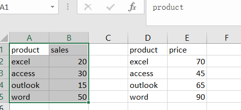
Assuming that you have two data sources in your current worksheet, and you want to create a combination chart with a secondary Axis based on those two data sources. How to do it. Just do the following steps:
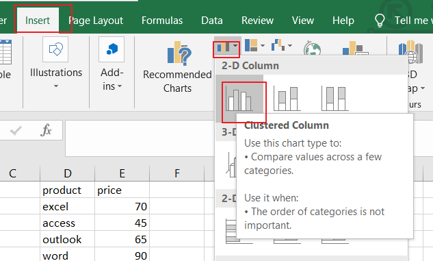
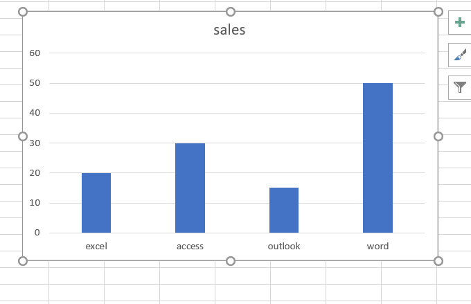
Step1: you can create a column chart based on your first data source, and select the data range of your data, then go to Insert tab, click Insert Column or Bar Chart under Charts group, click on the Cluster Column from the dropdown menu list. And a Column chart should be created in your current worksheet.
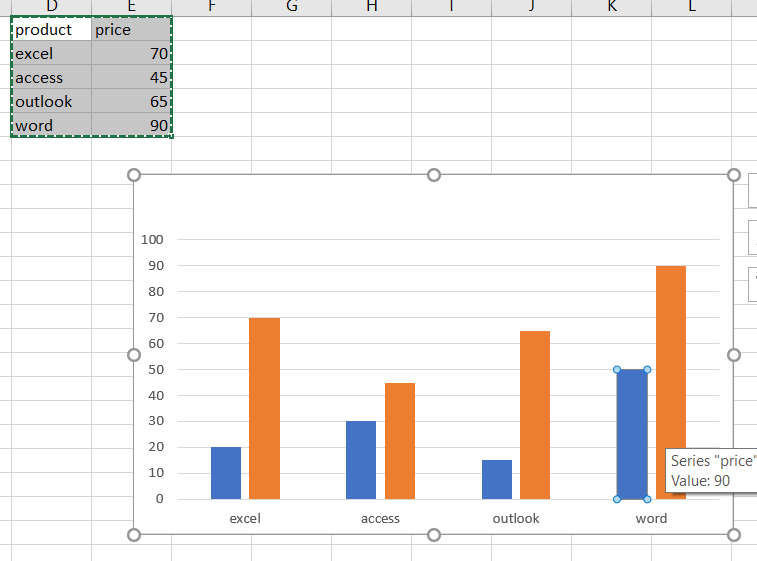
Step2: select the second data source, and press Ctrl + C keys to copy it, and then click any data series in the column chart, and press Ctrl + v to paste the second source data into that column chart. You should see that those two data sources have been combined in one Column chart.
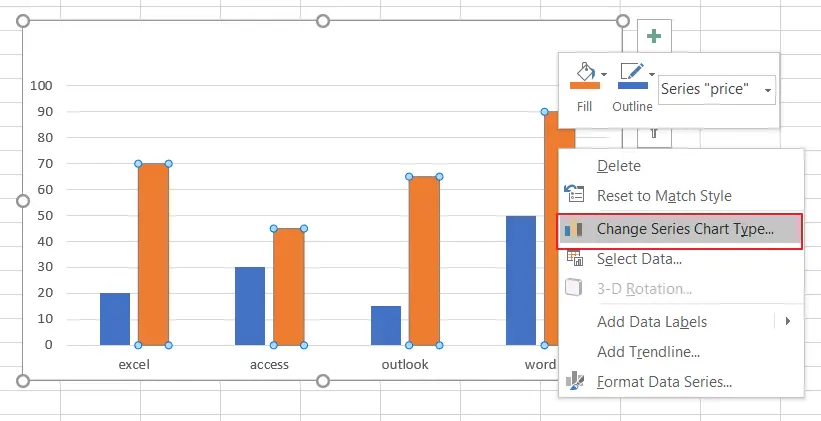
Step3: right click on any of the bars for your second data series, and click on “Change Series Chart Type” from the context menu, and the Change Chart Type dialog will open.
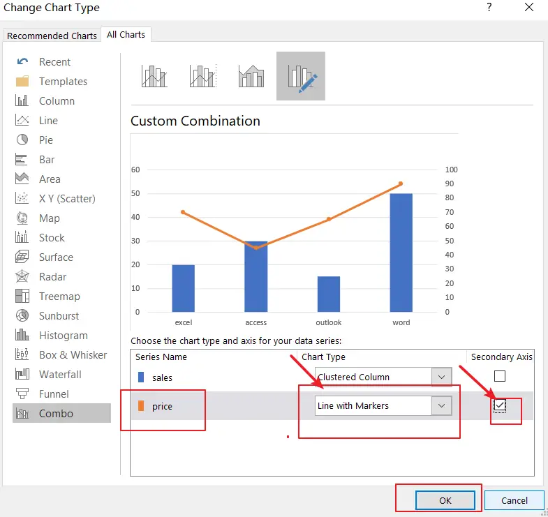
Step4: make sure Combo Category is selected in the Change Chart Type dialog box. Click on the drop-down list for price series, and select “Line with markes’. Check the Secondary Axis checkbox for price Series. Click Ok button.
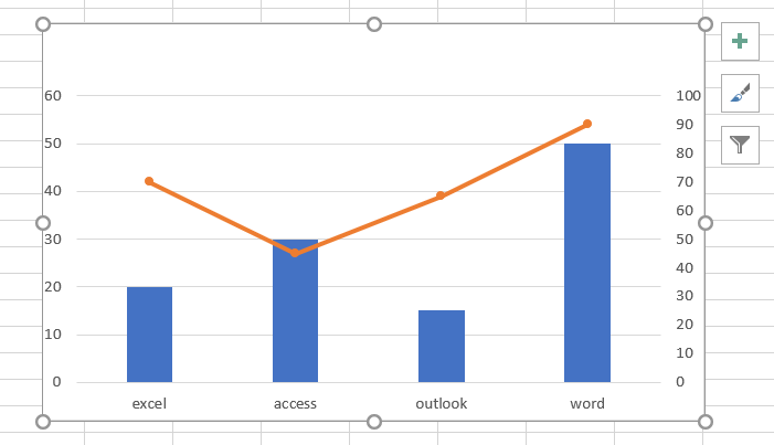
Step5: the combination chart should be created successfully.
Leave a Reply
You must be logged in to post a comment.