This post will guide you how to create a column chart with two-level Axis labels based on your original data in Excel. How do I create a Two-level X axis labels in your Chart with Pivot table in Excel 2013/2016.
- Create a Chart with Two-Level Axis Label
- Create a Chart with Two-Level Axis Label Based on Pivot Table
Assuming that you have a list of data, and you want to create a column chart with two-level X Axis labels. This post will introduce two ways to achieve the result. You need to change the original data in the First method, including sorting and merging cells. And a pivot table need to be created based on your data, then create a Column Chart based on Pivot table.
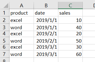
Table of Contents
Create a Chart with Two-Level Axis Label
You need to change the original data firstly, and then create column chart based on your data. Just do the following steps:
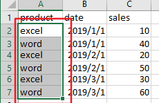
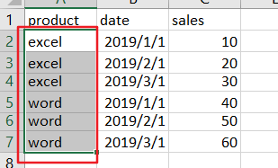
Step1: select the first column (product column) except for header row.
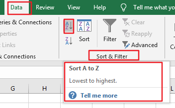
Step2: go to DATA tab in the Excel Ribbon, and click Sort A to Z command under Sort & Filter group. And the Sort Warning dialog will open.
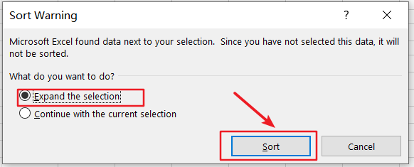
Step3: keep the Expand the selection option be checked, and click Sort button in the Sort Warning dialog box.
Step4: the selected cells should be sorted.
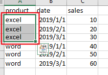
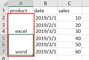
Step5: select the first same category of product in the first column, such as: Excel.
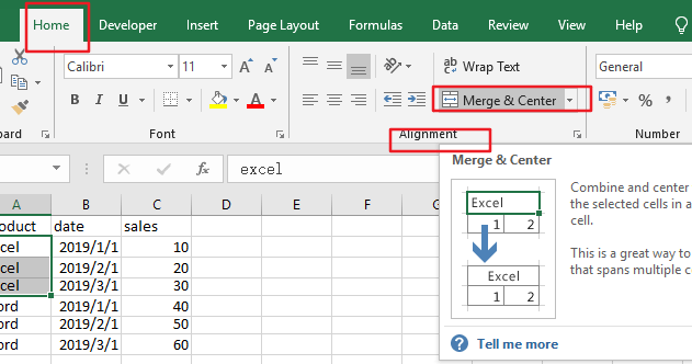
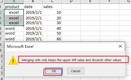
Step6: go to Home tab, and click Merge & Center command under Alignment group. And the Microsoft Excel warning dialog box will open. And Click Ok button. And the first product should be merged into one cell.
Step7: you need to repeat the step 5-6 to merger other adjacent cells with the same category of product.
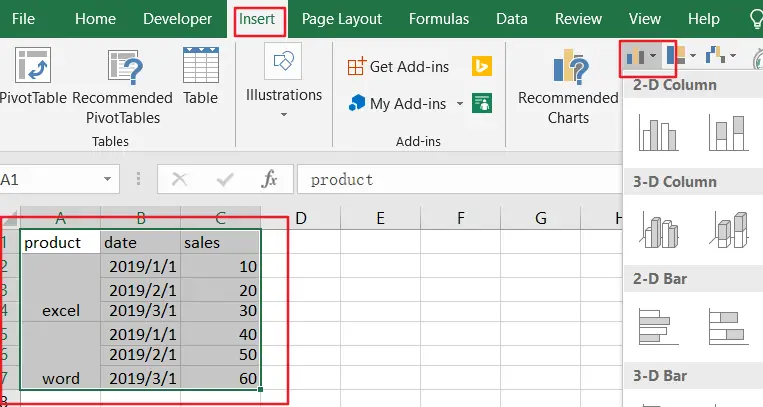
Step8: select your current source data, and go to Insert tab, click Insert Column Chart command and select Clustered Column from the dropdown list box.
Step9: you would see that the column chart with two-level Axis labels has been created successfully.

Create a Chart with Two-Level Axis Label Based on Pivot Table
You can also create a Column Chart with two-level axis labels based on a pivot table in your worksheet, just do the following steps:
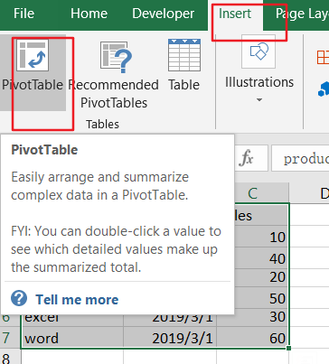
Step1: select your source data, and go to Insert tab, click PivotTable command under Tables group.
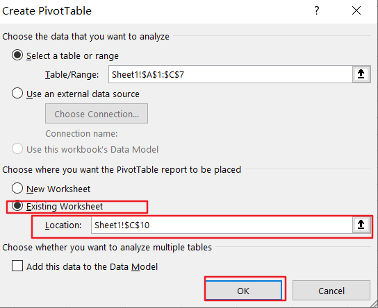
Step2: check the Existing Worksheet option and select a blank cell to place your pivot table in your current worksheet, and click Ok button.
Step3: choose product, data, sales fields in the PivotTable Fields pane. And the pivot table should be created based on your source data.
Step4: select your pivot table, and go to Insert tab, click Insert Column Chart command and select Clustered Column from the dropdown list box.

Step5: you would see that the column chart with two-level Axis labels has been created successfully.
Leave a Reply
You must be logged in to post a comment.