This post will guide you how to add vertical average line to a bar chart in Excel. How do I add an average line to your bar chart in Excel 2013/2016.
Table of Contents
1. Add Vertical Average Line to Bar Chart
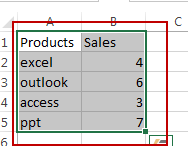
Assuming that you have created a horizontal bar chart based on the original data in Range A1:B5 in current worksheet, and you want to add a vertical average line across the horizontal bar chart at a specific value. How to do it. And you can do the following steps to add a vertical line to the horizontal bar chart type in Excel.
#1 select the original data that you want to build a horizontal bar chart.
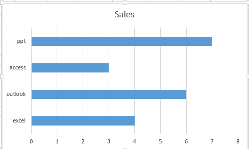
#2 go to INSERT tab, click Bar command under charts group. And select Clustered Bar chart type. A horizontal bar chart is created in your worksheet.

#3 we need to build a new series into the existing bar chart, so need to add two numbers 0 and 1 into two blank cells A6 and A7, then to the right of cells A6:A7, apply the following formula to calculate the average value for all of the sales data. Like this:
=AVERAGE($B$2:$B$5)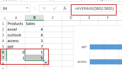
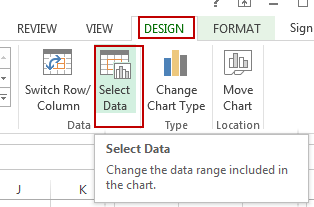
#4 select the chart, and go to DESIGN tab, click Select Data command under Chart Tools group. And the Select Data Source dialog box will open.
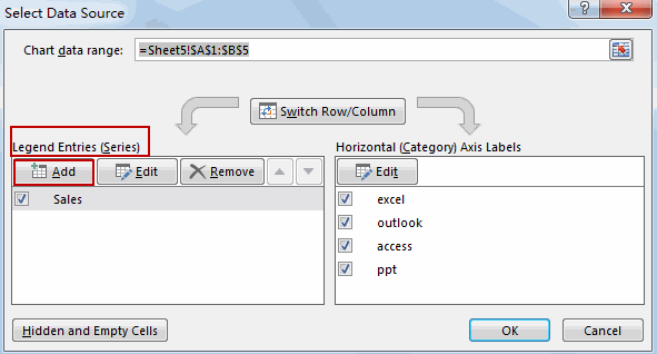
#5 click the Add button under legend Entries section to add the Average Value series in the Select Data Source dialog box. And the Edit Series dialog will open.
#6 type “Average” as the name of the series. And specify the two cells (B6:B7) that contain the average values calculation. Click OK button.
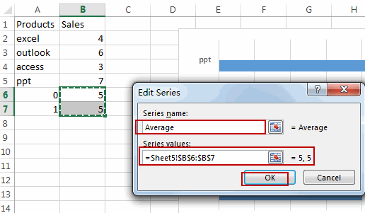
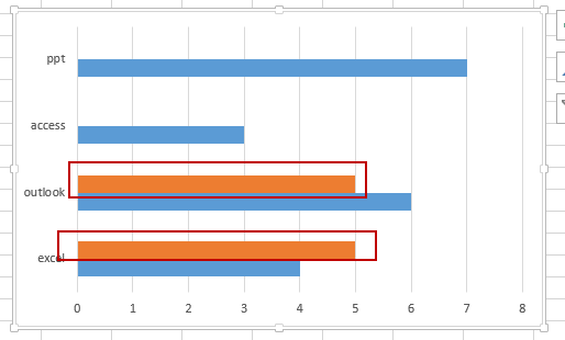
#7 click Ok button. Then the new average series has been added into the existing bar chart.
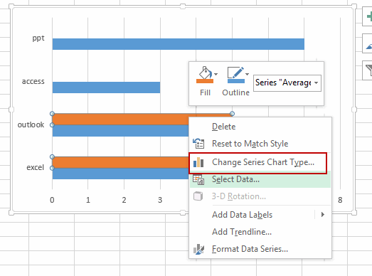
#8 right click on the average series in the bar chart, and select Change Series Chart Type from the popup menu list to turning the selected series into a vertical line. And the Change Chart Type dialog box will appear.
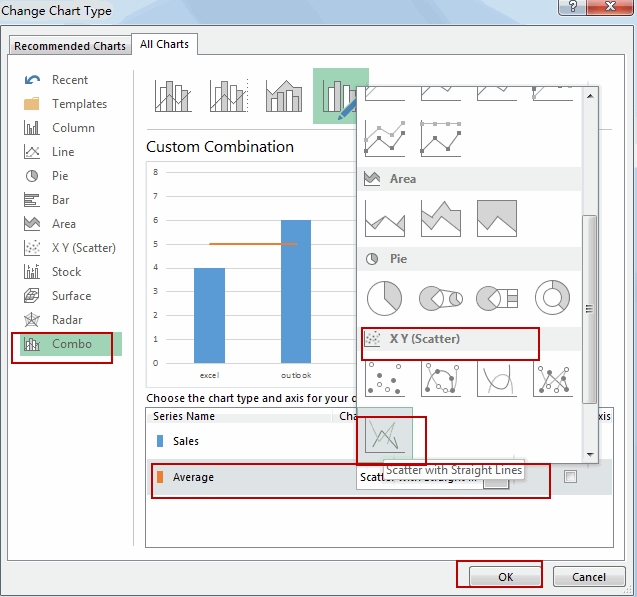
#9 select Combo option, select Scatter with Straight Lines chart type in the Chart Type list for the Average Series name in the Change Chart Type dialog, and select. Click Ok button to exit the dialog.
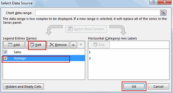
#10 right click on the bar chart again, choose Select Data from the popup menu list. And the Select Data Source dialog will appear. And then choose the Average series and click Edit button. The Edit Series dialog will appear.
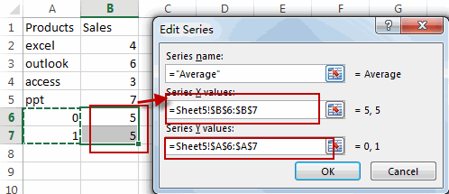
#11 you need to specify Series X and Series Y values for the vertical average line. And the Series X values should be the place on the x-axis for your vertical line, so you should choose the cells that contain average calculation. And the Series Y values should be the place on the y-axis for your vertical line, so you can choose the cells that contain 0 and 1 numbers. Click Ok button.
#12 click Ok button. And you would notice that the vertical line has been added into your horizontal bar chart.
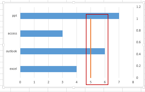
#13 you need to adjust y-axis of the average series, double-click the second y-axis on the right side of the chart. And the Format Axis pane should be shown.
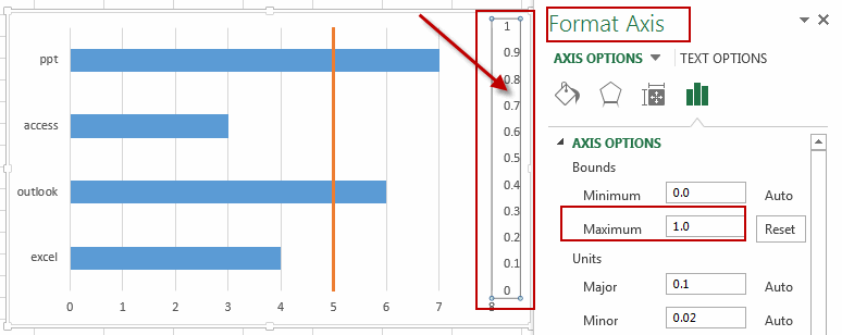
#14 type number 1 into the text box in the Format Axis dialog.
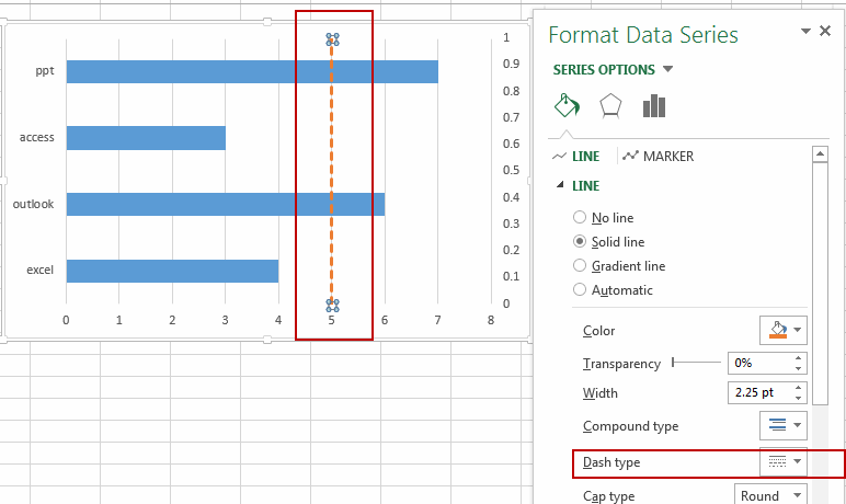
#15 right click on the vertical line, and select Format Data Series from the popup menu list. You can change the colors and design of the chart as you need. Like this:
2. Add Vertical Average Line to Bar Chart
This Excel video tutorial, we’ll guide you through the process of adding a vertical average line to a bar chart in Excel, enhancing your data visualization with clear indicators of average values.
3. Related Functions
- Excel AVERAGE function
The Excel AVERAGE function returns the average of the numbers that you provided.The syntax of the AVERAGE function is as below:=AVERAGE (number1,[number2],…)….
Leave a Reply
You must be logged in to post a comment.