You can use the Win Loss chart to display the trends of the data that contain positive and negative values as different colors, it will help you quickly spot trends in a large data set. So it should be a great way to spot the trend is to add a Win/Loss Sparkline chart next to your existing data. And this post will guide you how to create a Win Loss Sparkline chart in your current worksheet based on your data.
Creating Win/Loss Sparkline Chart
To generate win loss Sparkline chart, you need to follow these steps:
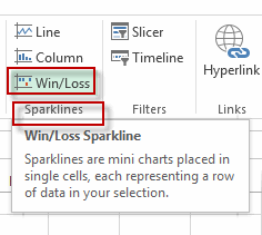
#1 go to INSERT tab, click Win/Loss command under Sparklines group. The Create Sparklines dialog will appear.
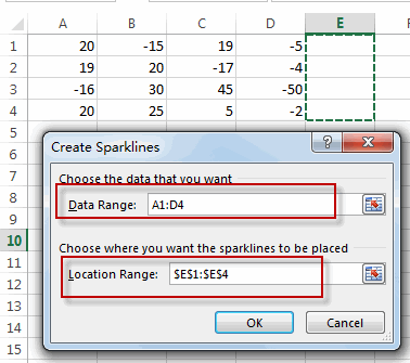
#2 choose the data that you want to create Sparkline, such as: A1:D4, choose where you want the Sparklines to be placed, such as: E1:E4 and press OK.
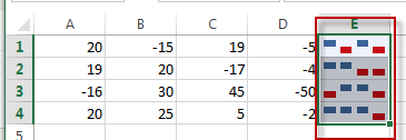
#3 you will see the Win Loss sparkline chart is displayed in the range E1:E4.
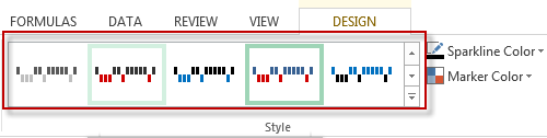
#4 you can change the style of the sparkline by clicking in the Sparkline and then choosing the style drop down list box.
Leave a Reply
You must be logged in to post a comment.