This post will guide you how to break the Chart Y axis in an Excel worksheet. How do I make a chart with a break Y axis in Excel.
Table of Contents
1. Break Chart Y Axis
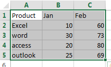
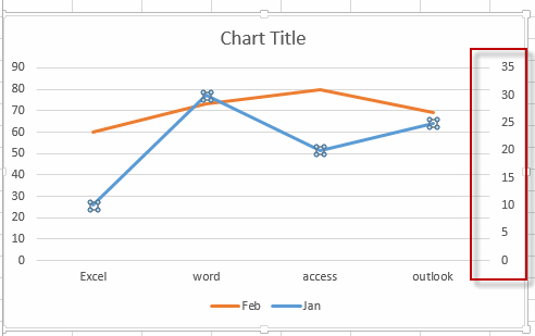
For example, Assuming that you have the data in a range (B2:B5) from 10-50 and another range (C2:C5) from 60-90. You have create a line chart based on the data in your worksheet. And now you want to break the Y-axis in the existing chart. How to achieve it. Just do the following steps:
#1 select the range of cells A1:C5 as the source data of the chart.
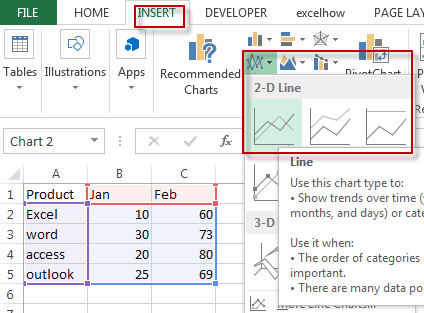
#2 go to INSERT tab, click 2-D Line button under Charts group to create a Line chart.
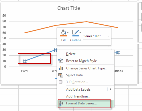
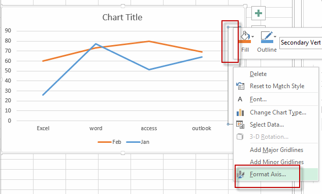
#3 right click Data Series at the bottom of the chart, select the Format Data Series from the drop-down menu list.
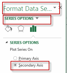
#4 select the Secondary Axis radio button in the SERIES OPTIONS section under Format Data Series pane.
#5 the current chart added one more Y-Axis and it also called the secondary vertical axis.
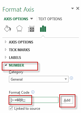
#6 right click on the secondary Y axis and select the Format Axis from the drop down list.
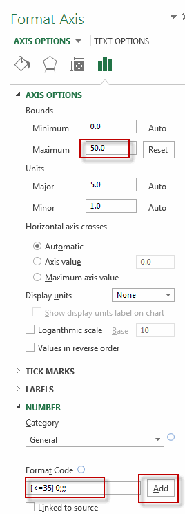
#7 under the Format Axis pane, type the number 50 into the Maximum box, and type the [<=35] 0;;; into the Format Code text box in the Number section, and click Add button.
#8 right click on the primary Y axis in the chart, and select the Format Axis from the drop down list. Type the [>=60]0;;; into the Format Code text box in the Number section, and click Add button.
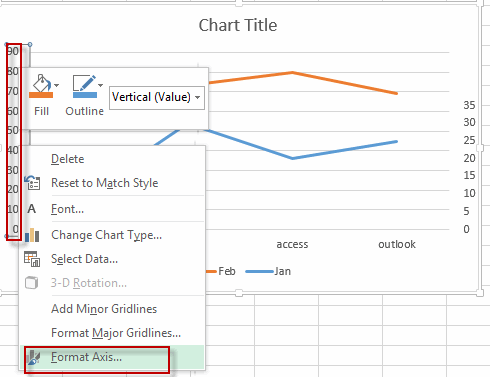
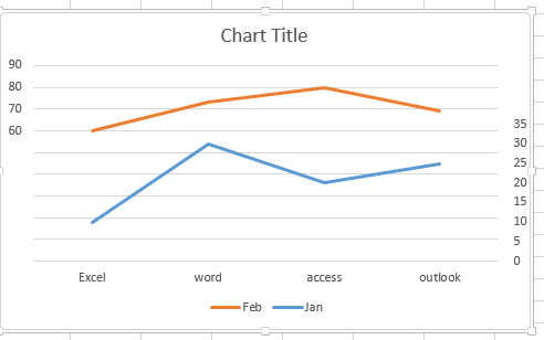
#9 you will see that the chart Y axis has been broken in your current chart.
2. Video: Break Chart Y Axis
Welcome to this Excel video tutorial where we delve into the nuanced world of breaking the Y-axis in your charts. Effective data representation is crucial, and understanding how to break the Y-axis can significantly enhance the clarity of your visualizations.
Leave a Reply
You must be logged in to post a comment.