This post will guide you how to add grand total line to a pivot chart in Excel. How do I show grand total line in an existing pivot chart in Excel. How to add average line to pivot chart at top position in Excel. How to add a grand total line on an Excel stacked column pivot chart.
Table of Contents
1. Adding Grand Total or Average to Pivot Chart
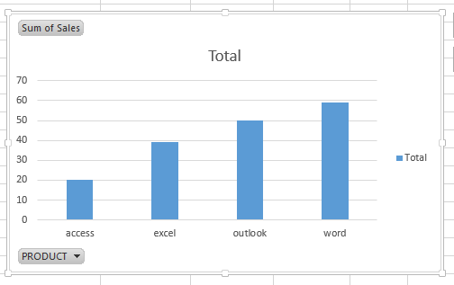
Assuming that you have a list of data in range B1:C5 that contain sales data and you will create a pivot table based on those data, and then create a column chart based on the created pivot table. Now if you want to add average line in the pivot column chart, how to achieve it. Just do the following steps:
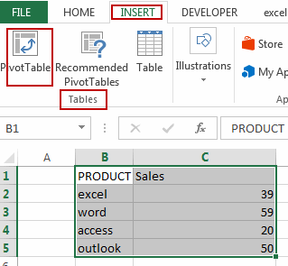
#1 select the source data B1:C5, and go to INSER tab, click PivotTable command under Tables group to create a pivot table. And the Create PivotTable dialog will open.
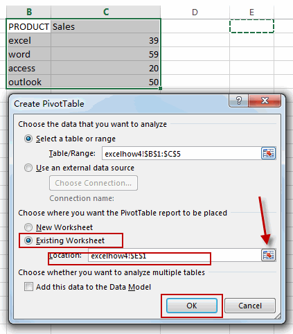
#2 select Existing Worksheet radio button, and select one cell as the location. Click Ok button.
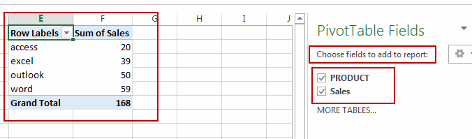
#3 checked Fields in Choose fields to add to report section in PivotTable Fields pane. And the pivotTable is created.
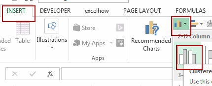
#4 select the above pivot table, and go to INSERT tab, click Insert Column Chart command under Charts group. And one Column Chart based on the pivot table is created.
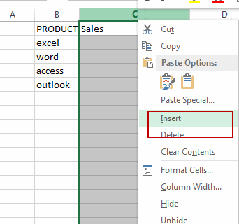
#5 select the Sales column in the original data, and right click on it, select Insert from the popup menu list to insert a new column, and type Average in the first cell.
#6 type the following formula in the Average column, and then press Enter key, and then drag the AutoFill Handle down to other cells.
=AVERAGE($D$2:$D$5)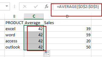
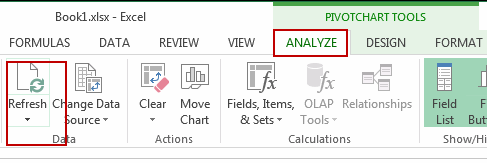
#7 select the pivot column chart, and go to ANALYZE tab, click Refresh command under Data group.
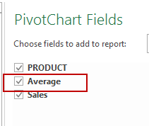
#8 The Average field will be displayed in the PivotChart Fields pane, and then checked Average checkbox.
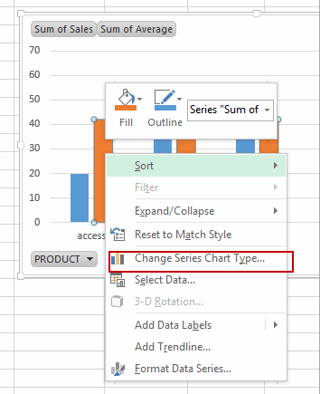
#9 select Average Data series in the pivot chart, and select Change Series Chart Type, and the Change Chart Type dialog will open.
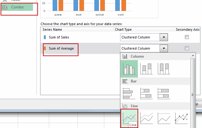
#10 click Combo menu in the left pane, and choose the Sum of Average box in the Choose the chart type and axis for your data series section, and select Line as Chart Type. Click OK button.
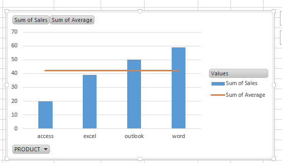
#11 the average line has been added into the pivot chart. Let’s see the result.
2. Video: Adding Grand Total or Average to Pivot Chart
In this Excel video tutorial, you’ll learn a valuable skill – adding a grand total line to a Pivot Chart in Excel. This can make your Pivot Charts even more informative and insightful.
Leave a Reply
You must be logged in to post a comment.