This post will guide you how to wrap the text of x-Axis labels on Excel Charts. How do I wrap x axis labels in a chart in Excel 2013/2016.
When the labels on the X-Axis are too long, they can overlap, making it difficult to read the chart. Wrapping the text of X-Axis labels is a useful technique to avoid this problem and make your chart more readable.
Table of Contents
1. Warp X Axis Labels
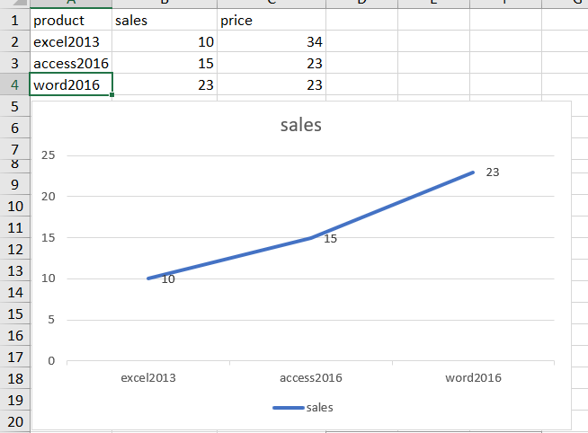
Assuming that you have created a column chart with relatively long labels on X axis the program by default puts the label in one line. And the axis labels are overlapping onto each other. So you may be want to warp axis labels in your chart. How to force the Excel to wrap x-axis labels in your chart. Just do the following steps:
Step1: select one label cell in your source data (such as: Cell A2), and replace the original label with the following formula:
="excel"&CHAR(10)&"2013"Step2: you would see that all X axis labels have been wrapped.
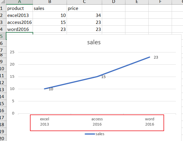
Note: you can also add a line break in your label cell with ALT + ENTER shortcut, it will also be reflected in your chart to warp X-Axis labels.
2. Related Functions
- Excel CHAR function
The Excel CHAR function returns the character specified by a number (ASCII Value). The syntax of the CHAR function is as below: =CHAR(number)….
Leave a Reply
You must be logged in to post a comment.