This post will guide you how to create a population pyramid chart in excel. How do I make a population pyramid in Excel 2013/2016.
Create a Population Pyramid Chart
Assuming that you have a list of data in Range A1:C6, in which contain the population data for your country or company. And you want to make a population pyramid chart based on your data in your worksheet. Just do the following steps:
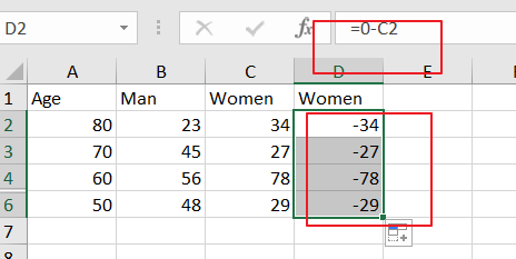
Step1: you need to create one column with negative values. normally, Women are on the left of a population pyramid, so you need to create one column with negative values, just need to perform a subtraction of one column with 0. So you need to type the following formula in new column, and press Enter key on your keyboard, and then copy this formula for the other cells to apply this formula.
=0-C2
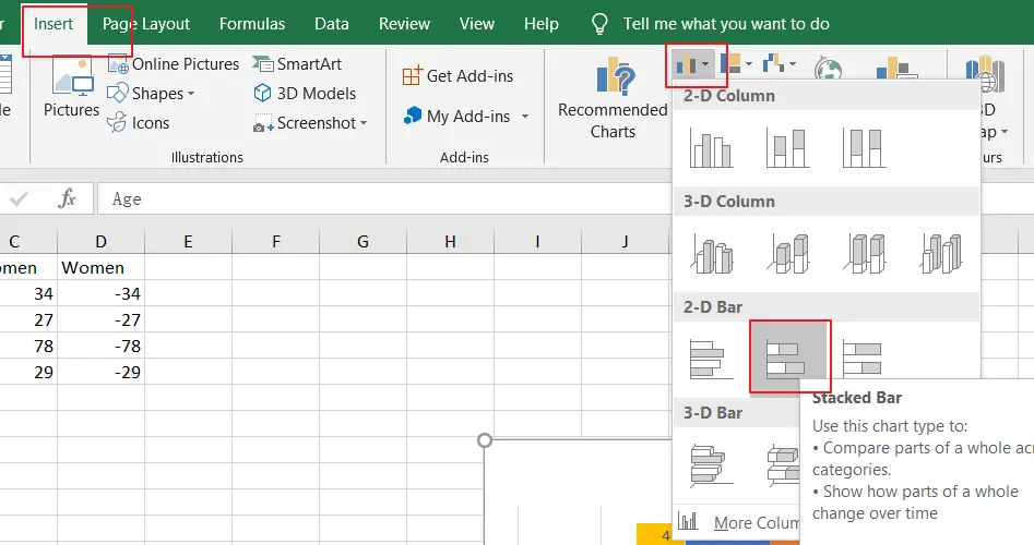
Step2: you need to select your data A1:D6, and go to Insert tab, click Insert Column or Bar Chart command under Charts groups. and then select Slacked Bar from the drop down menu list. You should see the following chart.
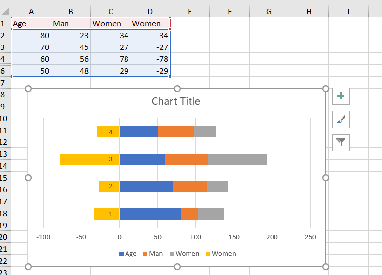
Step3: from the above chart, you should see that there are two Women series, including a positive column and a negative column, and you need to remove the positive column.
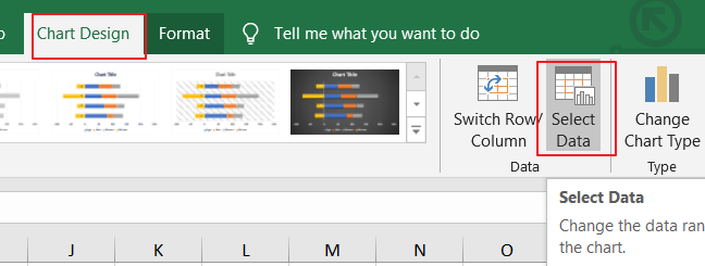
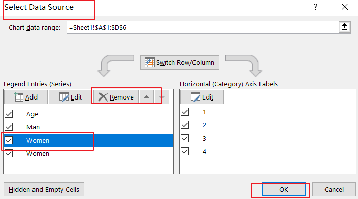
Step4: select your chart and go to Chart Design tab, and click the Select Data command under Data group. and the Select Data Source dialog will open.
Step5: you need to select the first Women entry or that positive Women entry in the Legend Entries section, and then click on Remove button.
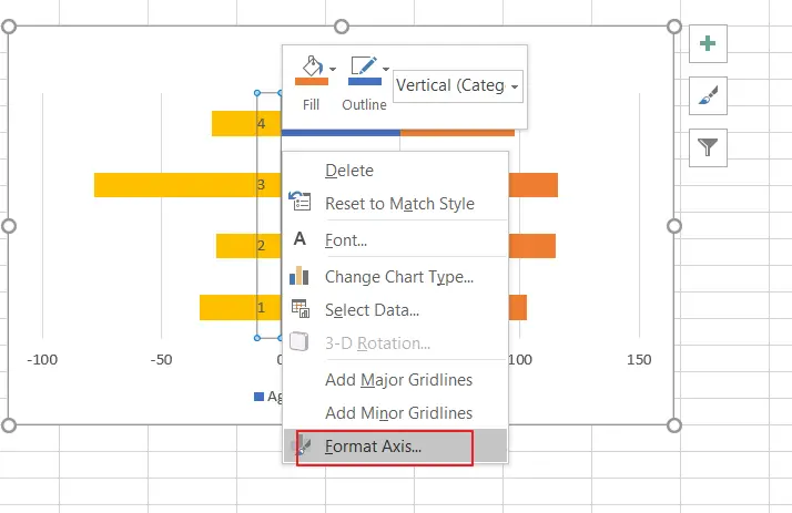
Step6: right click at the Y axis, and select Format Axis from the context menu list. and the Format Axis pane will appear.
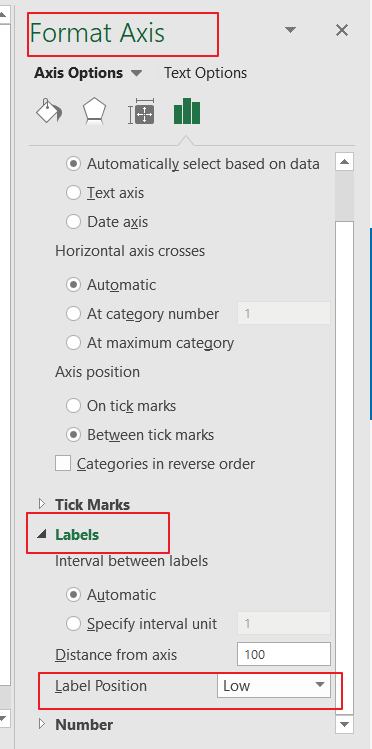
Step7: click on LABELS section and click it to expand its options, and select Low option from Label position list.
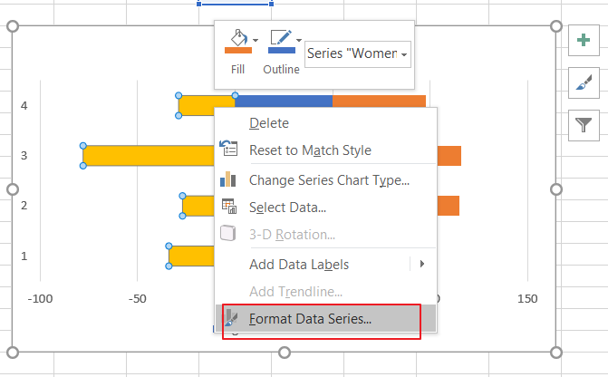
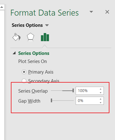
Step8: select one series and right click on it, and then select Format Data Series from the context menu list. And the Format Data Series pane will appear.
Step9: adjust the Series Overlap and Gap Width to 100% and 0%.
Leave a Reply
You must be logged in to post a comment.